

 « Next Article
 Prev Article »
Article Table of Contents
There’s a moment that decides whether a cannabis product sells or sits:
It happens fast. In a retail store or dispensary, people are not reading deeply. They are scanning: comparing shapes, colors, labels, and how a product holds space next to others.
That moment happens before the jar is opened. It happens before anyone looks at terpene profiles, THC percentages, or strain names.
That moment is packaging.
Cannabis packaging design carries most of the weight in that first impression. It signals price, quality, and care before a single word is read. In a market where shelves are crowded and products often sound similar on paper, visual presentation does most of the work.
“Perceived value” comes from that first visual read. It is not only about looking good. It is about being understood quickly in a dense retail environment. This is where cannabis brand shelf presence starts to matter. A product that blends in gets treated like everything else. A product that stands out gets a second look, sometimes the purchase.
At 420 Websites & Design, we see this constantly. Brands with killer flower struggle while average products fly off shelves because one looks premium and the other looks forgettable. The sections ahead break down why this happens and how packaging decisions change sales outcomes in practice.
Perception Is the First Product Your Customer Buys
Cannabis customers don’t experience your product first. They experience your brand.
Before aroma, effects, or quality, they judge your packaging. Humans are wired to associate design with value. Clean lines suggest professionalism. Weight implies quality. Consistent branding signals trust.
When your packaging looks cheap, rushed, or generic, customers subconsciously assume the product inside is the same.
Design shapes assumptions. Clean structure can suggest care in production. Consistent typography and layout can signal reliability. Material choice and print finish can imply price level. None of this needs explanation for it to register.
When packaging looks rushed or inconsistent, people tend to assume the product follows the same standard. That judgment happens early, often without awareness.
This isn’t about purely decoration. It’s about how cannabis packaging design sets expectations before anything is consumed. Those expectations shape satisfaction, and satisfaction drives whether people come back for the same brand or move on.
Cannabis Is a Visual Shelf Battle
Walk into any dispensary and look at the shelves.
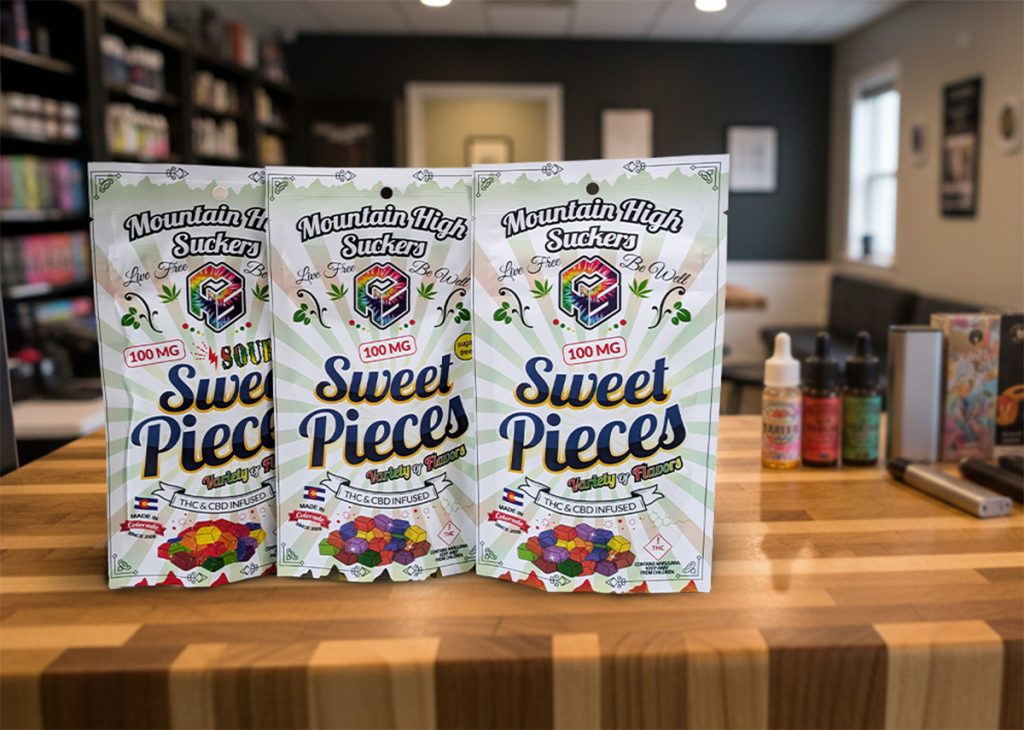
Jars blend together. Mylar bags stack like playing cards. Boxes fight for attention in crowded cases. In that environment, the best product does not win. The most visually confident product does.
In that setting, cannabis packaging design does most of the work before a conversation ever starts. People are not comparing lab results at first glance. They’re reacting to shape, contrast, and how clearly a brand holds its space.
Good packaging tends to do a few simple things at once. It is easy to notice without being loud. It signals quality without needing long explanations. It feels like it belongs to a brand that knows what it is doing.
Good packaging does three things instantly:
- It stands out without screaming
- It communicates quality without explanation
- It feels intentional and professional
If your packaging disappears into the shelves, your sales will too.
Premium Packaging Justifies Premium Pricing
One of the biggest mistakes cannabis brands make is underpricing quality products because they are afraid customers will not pay more.
Customers will pay more.
They just won’t pay more for something that looks cheap.
High-end packaging reframes price from a risk into a signal. It tells the buyer this product is worth it. It belongs in the premium category. It was made with care.
This is where cannabis packaging design directly affects pricing power. Packaging is often the first signal of where a product sits in the market. If it looks basic, the price feels high. If it looks intentional and well built, the price feels expected.
Strong packaging shifts how value is read. It turns price into a reflection of positioning instead of a point of friction. That shift matters most at the shelf, where cannabis brand shelf presence is doing silent work before anyone asks a question or checks a label.
This isn’t unique to cannabis: it shows up in every category where products compete visually. Brands that invest in packaging are not just improving appearance. They are supporting the price they want to charge, right from the first impression.
When packaging elevates perceived value, price resistance drops.
Inconsistent Design Erodes Brand Trust
Many cannabis brands evolve quickly. New strains. New SKUs. New formats. The problem is that design often lags behind growth.
Different labels. Different fonts. Different colors. Different messaging. The result is a brand that feels fragmented and unreliable.
That is where problems start. Labels change style from batch to batch. Fonts shift. Colors drift. Messaging does not stay aligned. On a shelf, the brand stops looking like one thing and starts looking like several unrelated products. This weakens cannabis packaging design. It also reduces cannabis brand shelf presence because nothing feels anchored and customers can’t easily connect one product to the next.
Consistency is not about being boring. It is about being recognizable.
When customers see your product again and immediately know it is yours, trust builds. Trust drives repeat purchases. Repeat purchases build real brand equity.
Compliance Does Not Excuse Bad Design
Cannabis packaging is regulated. Every brand has to work within those rules.
What many brands forget is that compliance and good design are not opposites. They can coexist. In fact, the best cannabis packaging designs are built around compliance, not constrained by it.
The mistake is treating compliance and cannabis packaging design as if they are in conflict. They are not. Good design does not disappear under regulation. It adapts to it – the structure changes, but the thinking stays the same.
Strong packaging systems are built with constraints in mind. Label requirements, warning text, and legal information all take up space. Within that space, hierarchy still matters. Typography still needs control. Spacing still needs intent. That is what keeps cannabis brand shelf presence clear, even when labels get dense.
Clear hierarchy. Smart spacing. Intentional typography. Strong brand systems. These things work within regulations, not against them.
Compliance is not a design limitation by itself. It becomes one when brands stop designing and start just placing required elements wherever they fit.
Using compliance as an excuse for ugly packaging is a costly mistake!
Packaging Is a Silent Salesperson
Your packaging works when your budtender is busy. It speaks when your brand is not there to explain itself. It reinforces quality after purchase and shapes how customers talk about your product.
People photograph packaging. They remember packaging. They recommend packaging.
That is not an accident. That is strategy.
If your packaging does not tell a story, communicate value, and reinforce trust, you are leaving money on the shelf.
Good packaging keeps working after the sale as well. People bring it home. They notice it again. They remember how it felt to choose it. That memory shapes whether they look for the same brand next time.
When cannabis packaging design is weak, none of that happens. The product becomes forgettable once it leaves the shelf. That is lost attention and lost return customers, even if the product itself is strong.
Why High-Value Cannabis Brands Invest in Packaging
The cannabis brands that scale successfully understand one thing clearly. Perception drives purchase long before experience confirms it.
Better packaging does not just look good. It increases confidence. It reduces hesitation. It justifies price. It builds loyalty.
That is where cannabis packaging design carries real weight. It sets expectations in a crowded retail space where attention is limited and comparison is constant. Strong design does not need to over-explain. It gives enough clarity for someone to feel confident picking it up.
Better packaging also changes how people feel about price. It reduces doubt at the point of purchase. It makes higher pricing easier to accept because the product looks aligned with it.
Over time, that consistency builds repeat buying behavior. Not because the packaging is decorative, but because it supports trust at every step where decisions are made!
How Cannabis Brands Can Increase Perceived Value Through Design
You do not need to redesign everything overnight. You need intention.
Start here:
- Clarify your brand positioning before designing anything
- Choose materials that feel as good as they look
- Build a consistent visual system across all SKUs
- Design for shelf presence, not just mockups
- Treat packaging as part of the product, not an afterthought
Design is not just decoration. It is strategy made visible.
This Is Where 420 Websites & Design Comes In
At 420 Websites & Design, we help cannabis brands translate quality into perception. We design packaging systems that elevate value, reinforce trust, and move products faster at retail.
We understand cannabis compliance. We understand shelf dynamics. And most importantly, we understand that design exists to drive sales, not win awards.
If your product deserves to be seen as premium, your packaging needs to say so before anyone opens the jar.
If you are ready to increase perceived value and drive stronger sell-through, let’s talk!